• Home
  • About
  • WORK
    • Artistic Portfolio
    • Graphic Design
    • Oil and Acrylic
    • Charcoal
    • Watercolor
    • Mixed Media
    • Commissioned Work
  • Thought Catalog
  • Contact
Chelsea V Medina Art

CHELSEA V MEDINA

  • Home
  • About
  • WORK
    • Artistic Portfolio
    • Graphic Design
    • Oil and Acrylic
    • Charcoal
    • Watercolor
    • Mixed Media
    • Commissioned Work
  • Thought Catalog
  • Contact

The Met Meets The Mad

Here’s a cliché.

Describe yourself in three words.

We’re asked this question countless times throughout our lives for essays, interviews, and profiles with the ultimate goal being to consolidate and prioritize our best attributes.

Here’s a harder question.

Describe yourself in one word.

Harder.

Describe yourself in one image.

Logos.

With the creation of every new brand comes the necessity to create a visual representation of what you do, what you value, and what you’re going to do to make your voice heard in an over crowded market.

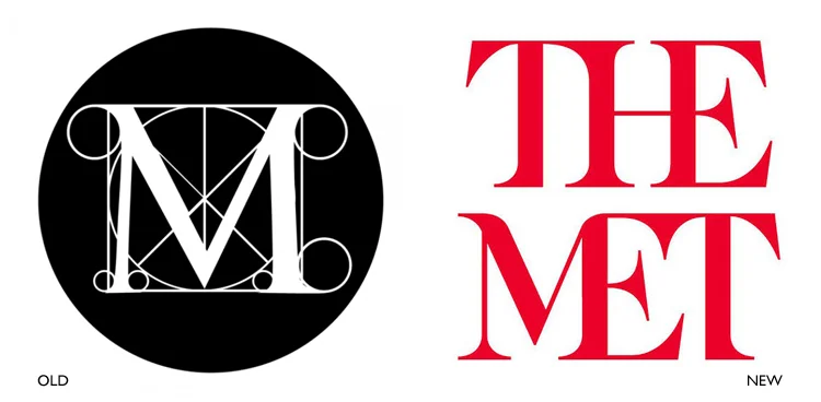
Starting March 1, 2016, The Metropolitan Museum of Art officially and completely changed its infamous “M” design to what’s thought to be an innovative and refreshing option. While David Brodsky, museum chairman, believes “its time for the Met to move forward”, numerous people have spoken out against the decision to rebrand.

The first design, seen 1971, has become a recognizable symbol for the museum for more reasons than just its appearance. Supporters and fans of The Met have created and connected to the various associations of the original work. Speculations include the design being based on a woodcut by Leonardo da Vinci’s teacher Luca Pacioli, a reference to a composition by Rafael, a representation of the museum’s architectural layout, or even a depiction of medieval manuscripts. The original design screams art history. It’s complex yet paradoxically simple composition of geometrical shapes and lines created layers of association and interest for art enthusiasts.

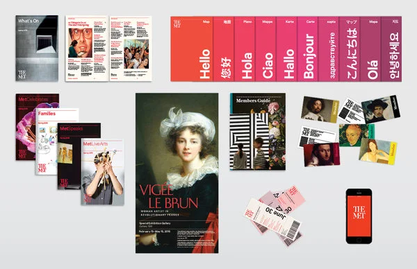
However, for those wishing to pursue other objectives for the museum, this same characteristic of complexity was posed as a potential turn off for visitors. Wishing to emphasize the theme of connectivity, The Met decided to invest in revisiting its visual identity. Their main goal involved overarching objectives of reach and relevance. Aiming to reduce the overwhelming nature of the 5000+ years of work within their walls, the new logo is intended to convey community and accessibility through the connected format of each letter. By choosing a font that’s “classical and modern”, the design is also envisioned to reference the museum’s past while still looking to the future.

Well, let’s here what the public thinks.

“The whole ensemble looks like a red double-decker bus that has stopped short, shoving the passengers into each other’s backs.” –Justin Davidson, Vulture.com

Ouch.

Criticisms of the new graphic identity involve everything from the font, the color, the layout, and the objective. The polarizing opinions have many weighing in their own “artistic” take. Contrasting the intention of The Met’s forward thinking approach, some blame the flop on the poor typography and believe it to be dated. Others hold the belief that a “museum shouldn’t try to be fashionable”. They don’t want The Met to disassociate itself from its most prominent attribute and service of providing and exemplifying history. The outrage was also posed to be stimulated by The Met’s earlier decision to discontinue their infamous metal admissions buttons to be replaced with a simple and economic sticker in 2013.

New advertising material

New advertising material

While brands always aim to be relevant, the decision to change things up always straddles a fine line between gaining new ground and loosing core foundation. Seth Godin, author of The Big Moo, included the advice that “a remarkable company doesn’t require spending tens of thousands or tens of millions on ‘reinvention’.”Sometimes there is a need for change, but Seth also offers that “customers sometimes love the simple stuff”.  

Millions of dollars are spent to create this bundle of shapes and colors. However, the ability to create associations and evoke responses from just those few shapes and colors is a masterful art. The harmonious composition of a strong design aesthetic with an equally strong exemplification of the brand’s mission and product proves to be the hardest balance to capture. 

With every art comes critique and criticism. 
Wednesday 03.16.16
Posted by Chelsea Medina
Comments: 2
 

Pullin For Pepsi

FINALLY! THIS IS WHAT I’VE BEEN WAITING FOR! 

Is this my PERFECT campaign?

Effective use of social media that curates response? Check.

Creative and unique artistic vision? Check.

Integration of today’s technology to advance the concept? Check

Expanding the capabilities of Net Art? Check

Use of augmented reality? BONUS!

Promotion through an influencer? BONUS!

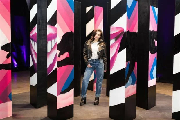
While born and raised with Coca Cola products in my blood, I have to admit that Pepsi really executed its recent marketing campaign to a tee by seamlessly blending various aspects of digital marketing with a unique visual concept. Collaborating with “Gif-iti” artists Insa, the installation brought physical paintings to life by treating them as a gif compilation. Exactly like the frame by frame nature of a gif, the 13 foot painting was treated in the same way by using 96 cameras to shoot 3 murals from every angle with each perspective being painted 24 times. The enormous amount of labor used to create all the frames really elevated the physical paintings beyond its typical capabilities. Insa’s mobile app then allowed the audience to view the piece in motion as it stitched the shots together.

While the art seems innovative and ground breaking, the concept for each mural was actually curated and collected from us! (well maybe not me because #ShareACoke) The compositions were visual interpretations of tweets from Pepsi Max fans. This marketing research through the use of social media was able to effectively capture recurring themes and implement them into the forefront of their strategy.  Additionally, capitalizing on their brand’s history of using influencers, specifically thriving off musicians, Pepsi’s decision to include Charlie XCX was appropriate to convey the fun, energetic, and cool nature of the project and product.

Pepsi also effectively incorporated an emerging Net Art theme of offline and online. With technology being a developing medium for art, Pepsi’s installation invites viewers to co-exist within the physical space but also participate in the digital space. As the definition of Net Art continues to develop, artists are constantly caught in that limbo of emerging completely into the digital and how to bring digital into real life, physical experiences.

This project really combines many rising trends in net art and perfectly aligns them with top notch digital marketing strategy. By choosing to highlight the artistic process in the video advertisement, Pepsi also invites and involves those who are not able to view the mural in person and gives them a taste (pun intended) of Pepsi Max. 

Wednesday 03.02.16
Posted by Chelsea Medina
Comments: 1
 

Spaced Out.

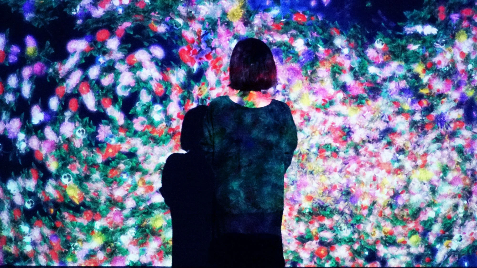
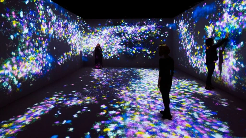
Flowers and People, Cannot Be Controlled but Live Together- Digital Installion

Flowers and People, Cannot Be Controlled but Live Together- Digital Installion

Art.

When we hear or see the word “art”, there could be many connotations that come to mind. Associated or even exemplified by the term “subjective”, the possibilities of various visual images about art are almost endless.

An expensive painting framed in a renowned museum guarded by lasers and heat detectors? A personal piece you created? Graffiti? A statue of a naked man? I really do mean endless.

With the subjective nature of art, there also exists almost the same amount of endless “meanings” or “purposes” to any piece. We all react differently, and we have all experienced that moment of seeing art and thinking“I don’t get it”.

With the evolving study of art and technological integration, creatives are working to completely submerge society in art. They are striving to change the conversation surrounding artistic practices and its definitions. Many are breaking the cliches and stereotypes about artists by combining various disciplines and creating new outlets for creativity. Approaches ranging from installations transforming your environment to interactive pieces calling for your personal participation, the mediums used are causing a response. They are causing an experience.


Flowers and People, Cannot Be Controlled but Live Together- Digital Installion

Flowers and People, Cannot Be Controlled but Live Together- Digital Installion

TeamLab, a famous Japanese collective, aims to be a disruptor and innovator within this realm of art. They are removing art from its frames and plastering it in as many aspects of our lives as possible. They’re shifting the conversation from the merging of technology and art towards to merging of art into life. By completely immersing you in an art form that requires not only your visual attention but the use of other stimuli, TeamLab challenges you think about art and its application as endless and relevant in various disciplines. 

“By using the digital, we think that new art can not just expand art itself, but also change the way that space is treated in a museum or gallery, the way that people value art,” - TeamLab
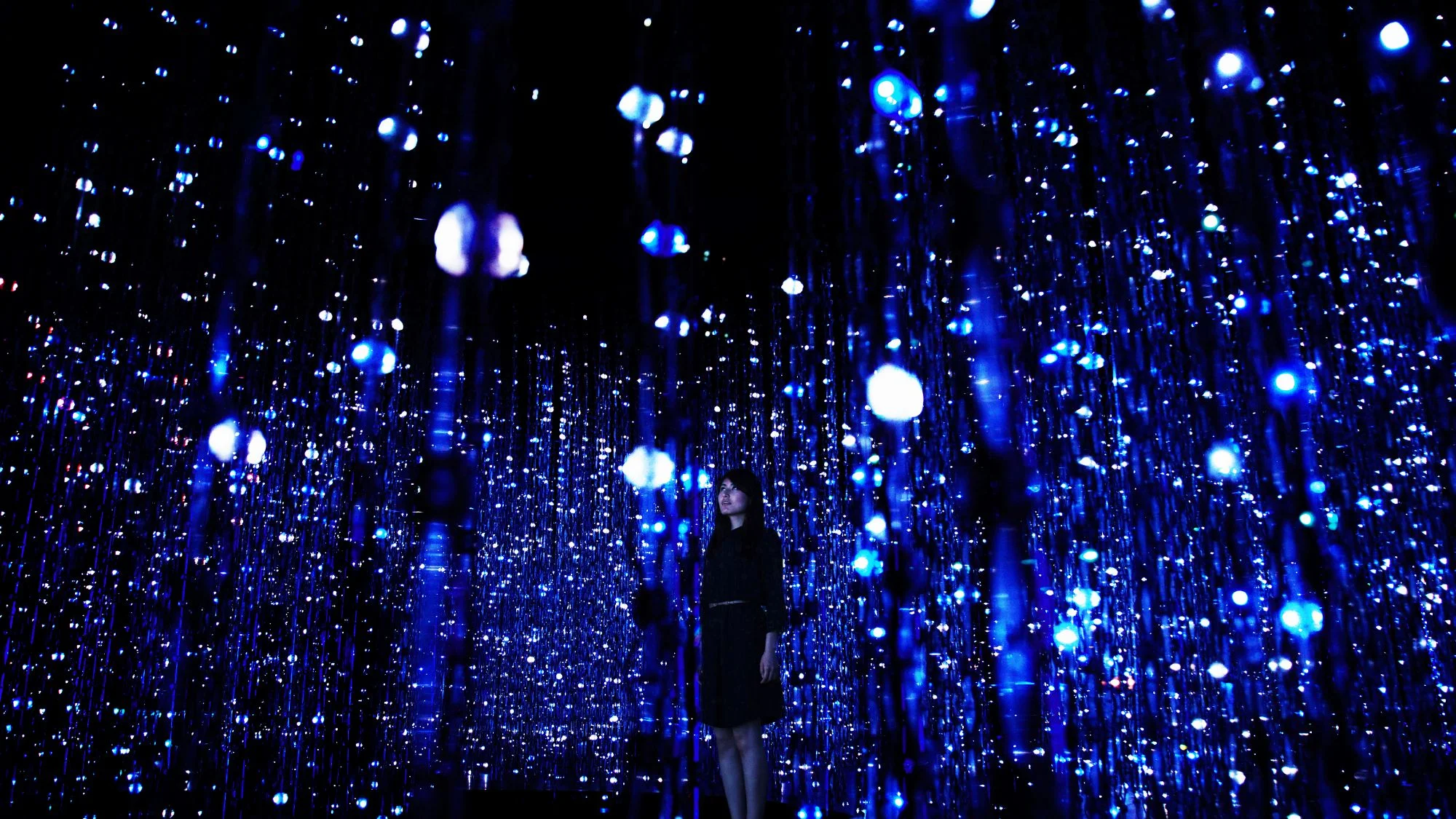
Crystal Universe- Digital Installation, Light Sculpture

Crystal Universe- Digital Installation, Light Sculpture

The group, consisting of over 400 artists, designers, and engineers, recently debuted “Living Digital Space and Future Parks”, 20 digital installations in Pace Gallery in Silicon Valley. Covering 20,000 square feet, the works encourage viewers to participate in this “digital playground”.  However, the surrounding graphics that create different digital environments are only one aspect of this collection’s immersive nature. TeamLab went a step further to engage their audience.

Breaking the traditional "headphones and lectures" feature seen in most museum exhibits, TeamLab integrated other technological trends to not only encourage engagement but also involvement. In Crystal Universe, participants are able to create their own patterns and sequences within the space themed light structures displayed before them. Other forms of interactions are also targeted to a younger audience in Sketch Aquarium where their own hand drawings of sea creatures are brought to life in projecting seascapes surrounding them. This real time personalization in the installations creates a new story with every viewer's interaction. While the technology may be the cause of the installation, it is really the audience that creates the piece. 

Not only is TeamLab applauded for the shear size of this installation project, but they are to be viewed as an example in this field for capturing the desire for physical immersion into art and use of digital engagement to promote interaction. TeamLab wants you to "get it". 

Monday 02.22.16
Posted by Chelsea Medina
 
Newer / Older